
Charts, worksheet and maps
The assistant can show figures in the conversation as a chart, as a worksheet or on a map. You do not need to switch anything on. It works in every persona: LEO, LEO Fiscaal, ZIA, VERA, BEVER and IRMA, and also in MAIA (on request).
Diagrams of structures, such as an ownership structure, a decision tree or a timeline, fall under Graph examples in Knowledge (login required). This page is about charts of figures.
When the assistant makes a chart, worksheet or map
Section titled “When the assistant makes a chart, worksheet or map”Usually you ask for one yourself. Sometimes the assistant chooses one on its own, when a series of figures reads better as a picture or a table.
| You want to… | You get |
|---|---|
| see a development over time, a comparison, a distribution or a relationship | a chart |
| have the individual figures, totals and averages, check them or export them | a worksheet |
| see where something is, or a figure per district or neighbourhood | a map |
A worksheet can also carry a chart of the same figures. Just ask for both.
Example requests:
- “Put the legal costs per year from this overview in a bar chart.”
- “Make a worksheet of the items in this budget, with totals and averages.”
- “Show the population over the last ten years with a trend line, and extend the trend three years ahead.”
- “Show the addresses from this dossier on the map.”
The assistant follows fixed rules here:
- Only figures from a source or a calculation. Every value comes from a source, a document, an earlier result in the conversation (such as a search result) or a calculation. No source, no chart. Under a chart or map there should be Source: with the reference date. For a worksheet, the source sits in the status bar of the panel. If that line is missing, ask where the figures come from.
- Calculated, not estimated. Statistics, trend lines and projections are calculated exactly. In its answer the assistant quotes the same figures you see in the chart or worksheet.
- Two or three numbers are not a chart. The assistant simply mentions them in the sentence.
- In the conversation, not in a document. When you work in a document beside the chat (see Drafts), a table goes into the text instead. The chart stays a block in the conversation.
Charts
Section titled “Charts”The chart appears as a block in the conversation. At the top it says Workspace with the title. Full screen enlarges it, Close full screen takes you back. Under the chart you see the source line (Source:) and sometimes one sentence to help you read it. Hover over the chart to see the values.
These types are available:
- bar chart, vertical or horizontal (horizontal for long labels, such as budget item names);
- line and area chart, for a development over time;
- pie and donut chart, for the distribution of a whole;
- scatter chart, for the relationship between two quantities.
Bars and areas can be stacked when the parts add up to a whole. A chart holds at most 12 series. A pie with more than six slices becomes unreadable, so the assistant groups the rest under “other”.
Want the same figures in another form? Ask in your next message, for example “make it a line chart”.
Trend line
Section titled “Trend line”When you ask about a trend or a relationship, the chart draws a dashed Trend line. This works on a vertical bar chart, a line chart, an area chart and a scatter chart. It does not work on a horizontal bar chart or on pie and donut charts. Under the chart you then see, for example:
Trend line slope 1,150 per unit on the x-axis · R² 0.93 · n = 10
How to read it:
- slope: how much the line rises or falls per step. When the labels are numbers, such as years, that is per unit on the x-axis (so per year). When they are words, such as months or quarters, it says per step.
- R²: how well the line fits the points. Close to 1 is a strong relationship, below about 0.5 a weak one.
- n: the number of points the line rests on. With fewer than five points a trend line is an indication at most.
Projection with an uncertainty band
Section titled “Projection with an uncertainty band”When you ask for a look ahead, for example “extend the trend three years ahead”, the trend line continues as a dashed line past the latest measurement. Around it lies a band Uncertainty (95%). The band starts at the latest measurement and widens the further ahead you look.
Under the chart the projection is listed per projected point, so you can read it without hovering:
Projection 2029: 52,400 — 95% interval 50,900 to 53,900
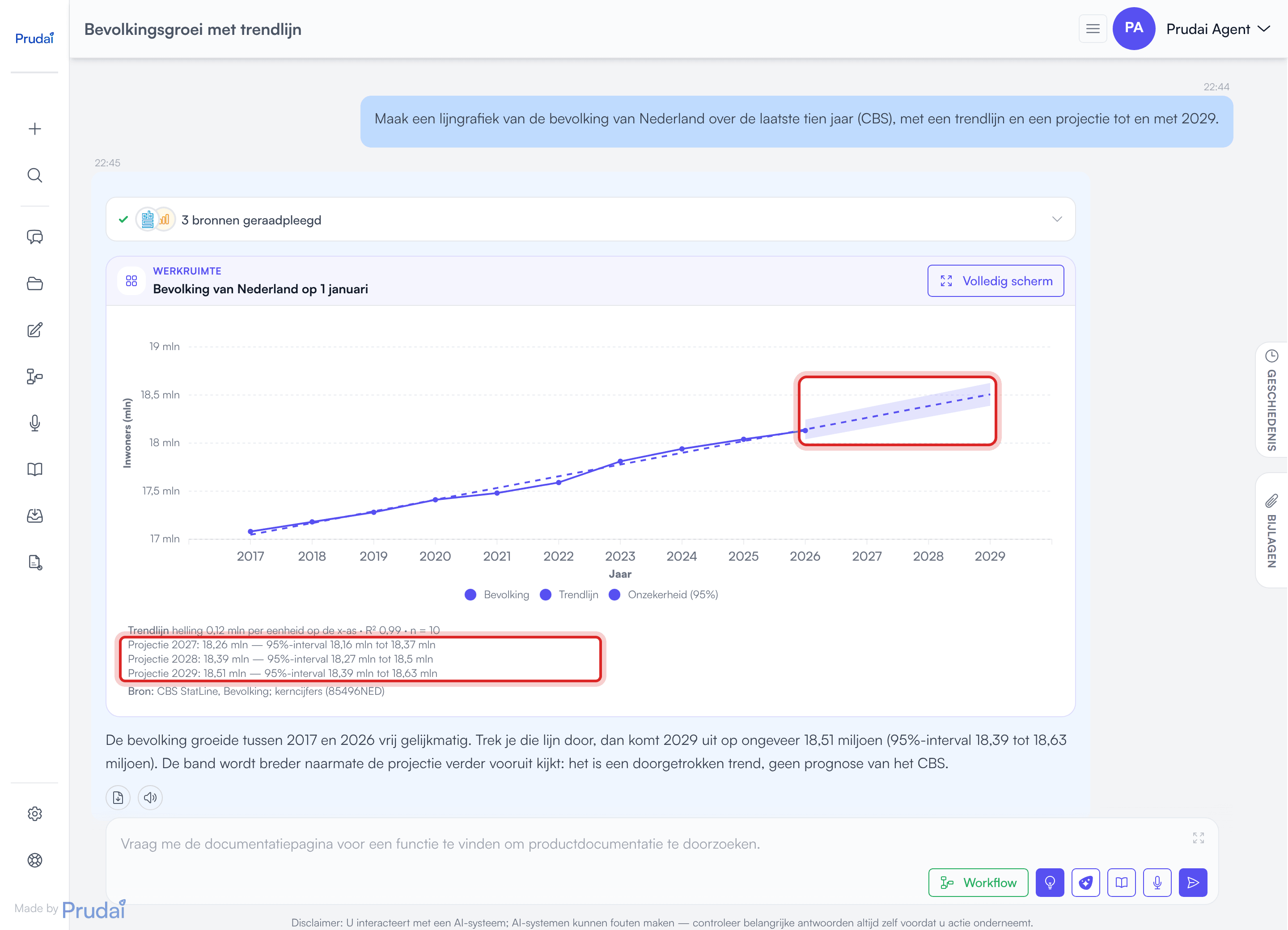
Hover over a projected point to see the trend line value marked “(projection)” and the limits of the band.
With fewer than three points no band can be calculated. The dashed line then continues without a band, and under the chart each projected point shows only the projection, without an interval:
Projection 2029: 52,400 (too few points for an uncertainty band)
Good to know:
- The assistant should quote a projection together with its range. If it only gives one number, look under the chart for the interval.
- A projection extends a straight line, nothing more. It does not account for policy, a break in the trend or other causes.
- Want to see your own scenario, a budget or a target path next to the actual figures? Ask for a worksheet with a chart. A trend chart only shows the extended trend. Your own figures go into the worksheet as a separate column, with a chart alongside.
Worksheet
Section titled “Worksheet”In the conversation: the Worksheet block
Section titled “In the conversation: the Worksheet block”When the assistant puts figures in a worksheet, the worksheet opens beside the chat by itself. The conversation shows a compact Worksheet block with the title and the size, for example “12 rows · 3 columns”. While the worksheet is open, the label at the top of the block changes to Open in the worksheet (it is on screen now) and the button becomes Close worksheet.
Did you close the panel, do you want to see a worksheet from earlier in the conversation, or are you coming back to the conversation later? Then click Open in worksheet on the block.
The workbook beside the chat
Section titled “The workbook beside the chat”The panel beside the conversation shows the workbook. Each conversation has one workbook, and every worksheet from that conversation is a tab in it, including worksheets from earlier in the conversation. The tab of the worksheet you open comes to the front.
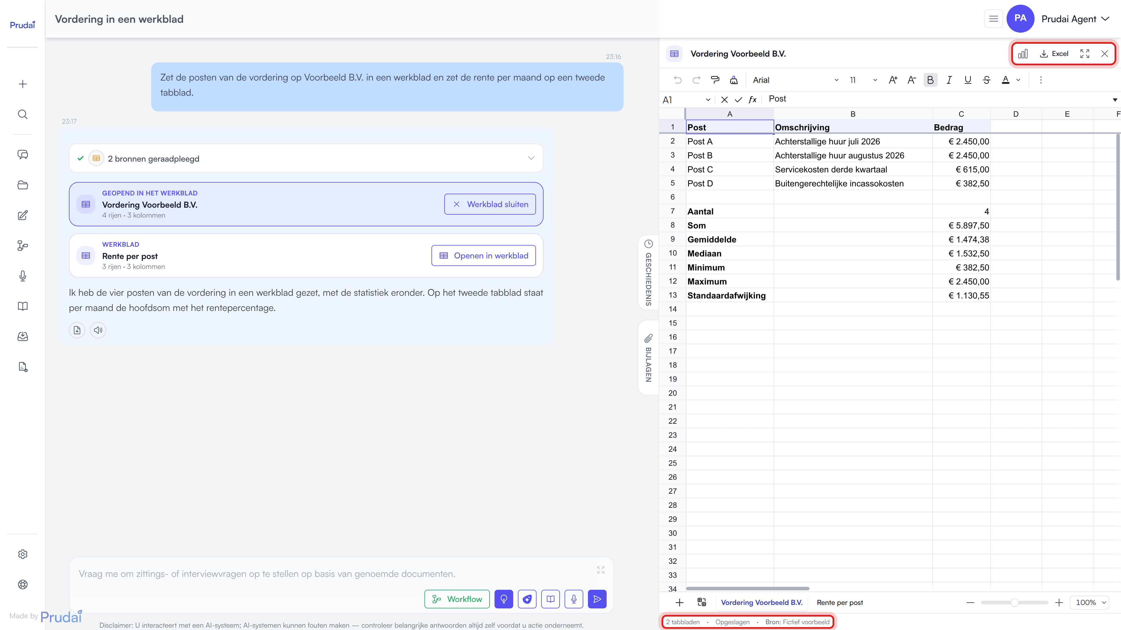
The workbook is a real spreadsheet. You can:
- edit or add cells and formulas;
- sort, filter and search;
- change number formats and styling.
When the app is set to English, numbers use English notation (1,234.56). A worksheet the assistant makes holds at most 300 rows and 20 columns. You can add rows and columns yourself. A workbook holds at most 50 tabs.
Statistics under the data. Under the data, each column of numbers gets a count, sum, mean, median, minimum, maximum and standard deviation. A worksheet the assistant makes carries Dutch labels: Aantal (count), Som (sum), Gemiddelde (mean), Mediaan (median), Minimum, Maximum and Standaardafwijking (standard deviation). A tab that the panel builds itself while the app is set to English carries English labels: Count, Sum, Mean, Median, Minimum, Maximum and Standard deviation. That happens with a worksheet from an older conversation, or with a deleted tab you bring back. The values are formulas: change a cell and they recalculate. Empty cells, ”-” and “n.v.t.” (not applicable) do not count.
Regression. When you ask for the relationship between two columns, or for a projection based on a column, the table also gets Helling (slope), Snijpunt (intercept), R² and, per requested point, Prognose bij … (forecast at …). In a tab the panel builds in English, these read Slope, Intercept, R² and Forecast at …. These are formulas too. The uncertainty band is not in the worksheet. To see it, ask for a chart: it appears in the conversation.
Saving. The workbook saves itself shortly after you stop typing. At the bottom a status bar shows the number of tabs, the save state (Saved, Not saved, Saving… or Save failed) and, if the assistant named a source, the source line (Source:).
Did the assistant write to the workbook in the meantime, or did you change it in another window? Then the latest version wins. You get a notice that your last change was not saved. Nothing is ever overwritten silently.
When you delete a tab, it does not come back by itself. If you later click Open in worksheet on that block again, the tab does come back.
Working in the workbook together with the assistant
Section titled “Working in the workbook together with the assistant”The assistant can read the workbook and write to it. Just refer to it, for example:
- “I changed the figures in the worksheet. What is the total now?”
- “Add a column to tab 2 with the growth compared to last year.”
- “Make a new tab with a summary per quarter.”
The assistant first reads the workbook as it is now, because your cells may differ from what it put there earlier. Then it writes cells, formulas or a new tab back. You see those changes in the panel as soon as its answer is finished.
Buttons in the panel
Section titled “Buttons in the panel”The top right of the panel holds mostly icons. For most of them, hover to see the name.
- The chart icon (Show chart) shows the chart of this tab, drawn from the cells as they are now. So your edits show up. The icon only appears when the worksheet has a chart. Click it again (Back to the sheet) to go back.
- Excel (Export to Excel (.xlsx)) downloads the whole workbook. On a narrow screen you only see the download icon. See Exporting to Excel below.
- The icon with arrows pointing outwards (Focus: collapse the chat) gives the worksheet the full width. Click it again (Leave focus) to bring the chat back.
- The cross (Close worksheet) folds the panel away. The workbook stays saved with the conversation.
Drag the edge of the panel to make it wider or narrower. On your phone the worksheet opens full screen. The arrow at the top left (Back to the chat) takes you back.
There is one slot beside the chat. When you open the worksheet, an open document or the History or Attachments drawer folds away, and the other way round.
Exporting to Excel
Section titled “Exporting to Excel”Excel downloads the whole workbook as Workbook.xlsx. It contains:
- all tabs;
- your formulas, with their last calculated result;
- number formats, bold text, fill colours and column widths;
- a frozen header row.
The chart of a worksheet does not go to Excel. You only see it in the panel, via Show chart. A separate chart in the conversation simply stays in the chat.
The print footer of each tab holds the source (if there is one) and the confidentiality marking with the export moment, your name and the line stating that the values were (partly) generated with AI.
A table in a regular answer has its own download button. See Export.
The map appears as a block in the conversation, just like a chart: Workspace with the title, Full screen and the source line (Source:) under the map. The base map is the official Dutch base map (Kadaster / PDOK). Area boundaries come from CBS (Statistics Netherlands) and the Kadaster.
On the map the assistant can show:
- points for addresses or places, for example locations from a dossier (at most 50);
- the outline of a municipality;
- districts or neighbourhoods of a municipality, optionally coloured by a figure per area. A legend in the bottom left then shows the unit or Value, from low to high.
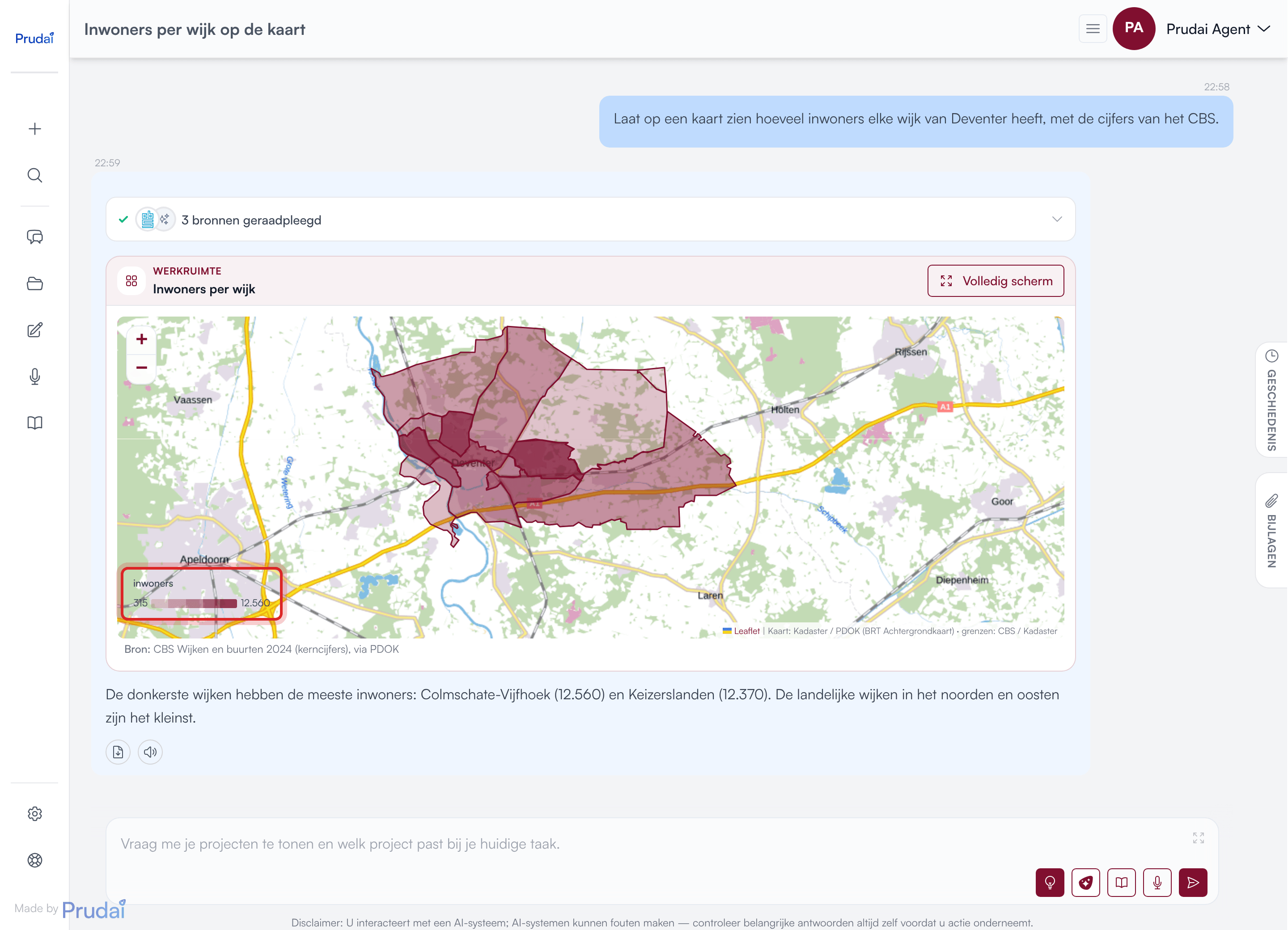
How to use the map:
- Hover over a point to see its name. Click the point to see its description.
- Hover over an area to see its name and, if it has one, its figure.
- Zoom with the + and − buttons. Zooming with the scroll wheel works in Full screen.
Good to know:
- The Netherlands only. The map cannot show areas outside the Netherlands.
- No guessed points. When the assistant cannot find an address, it says so. It does not place the point somewhere nearby.
- Names become official areas. District and neighbourhood names are converted to the official CBS areas. The assistant does not invent an area that does not exist.
- If you see Area boundaries could not be loaded., the map could not fetch the boundaries. The base map and the points stay visible.
In the sources bar
Section titled “In the sources bar”While the assistant works, the sources bar above the answer shows which step it takes (see Seeing what the assistant does). For charts, worksheets and maps you see these lines:
| Line | What happens |
|---|---|
| Draw a chart: … | The assistant draws a chart. The line names the title and the size, such as the number of series and points and whether a trend line is included. |
| Put figures in a worksheet: … | The assistant makes a worksheet and a new tab in the workbook. The line names the number of rows and columns, and whether a regression is included. |
| Open the workbook: … | The assistant reads the workbook of this conversation, or writes cells or formulas to it. |
| Show on the map: … | The assistant puts points or areas on the map. The line says how many. |
- Name the source and the period. “From the annual accounts, 2019 through 2024” gives a better chart than “put it in a chart”.
- Check the source line. Under a chart or map, and in the status bar of the worksheet, you should see where the figures come from. If there is no source, ask for it.
- Older conversation? If the assistant says in an older conversation that it cannot draw a chart, start a new conversation. An older conversation may still run on an earlier set of tools.